The Tokyo shop’s operations are finally down to just 15 days left. That’s about two weeks.
I recently heard some talk and suddenly realized something…
“I don’t even know what crowdfunding is” —that was the reality… “Huh?”
What really surprised me this time was that
“one-third” of the supporters are people I’ve never actually met…
It’s incredibly gratifying. Truly a wonderful world (*´ω`*).
If you want to get the novelties we made this time right away, “take advantage of crowdfunding”
I was totally wrong thinking most people who come to the shop read the blog…
Well, that’s fine too.
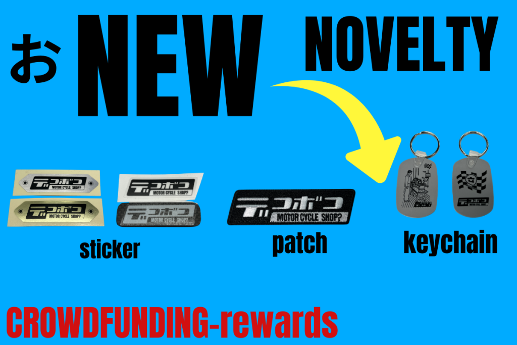
So with time running short, here’s this awesome novelty we made!
Brand new “Decoboco patch”
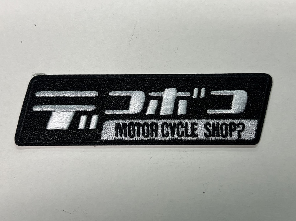
This time I made it in a parallelogram shape. It’s got a nice unique feel, don’t you think?
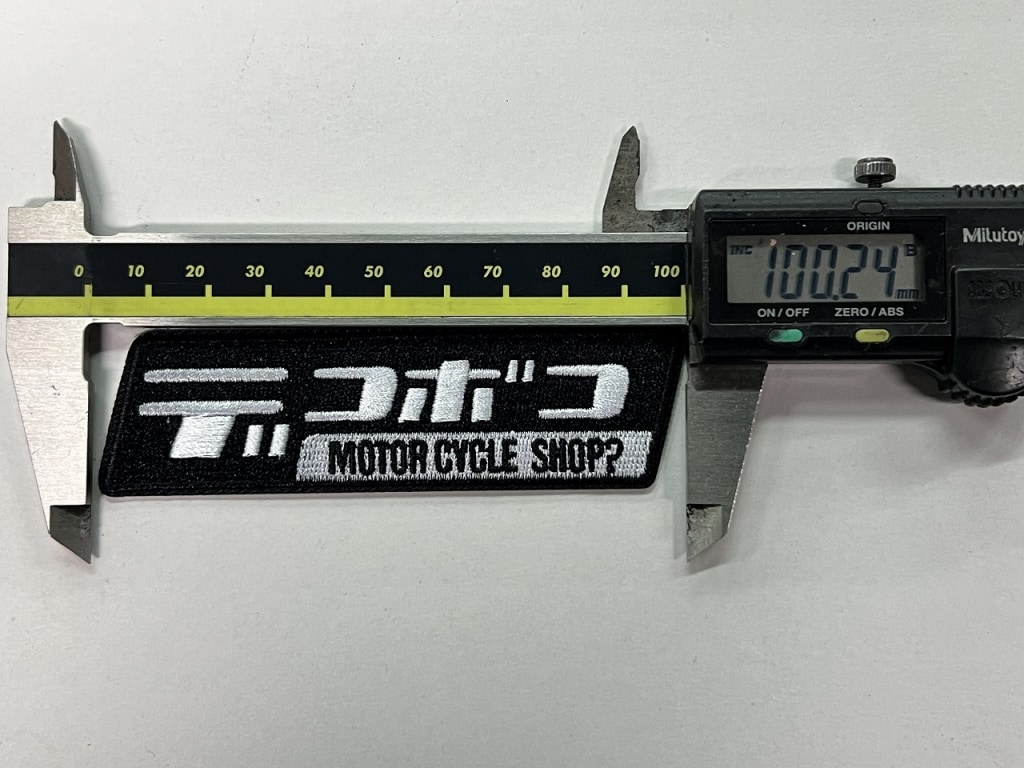
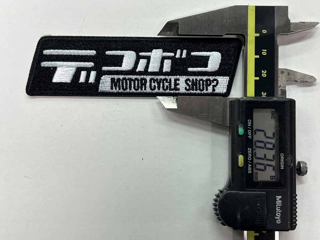
I think it turned out with a really practical size that I’m happy with (*´ω`*)
Decoboco sticker set, nameplate type (gold & silver)
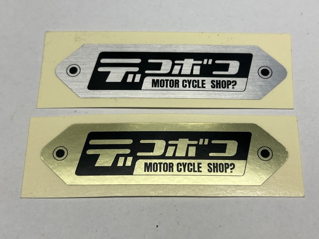
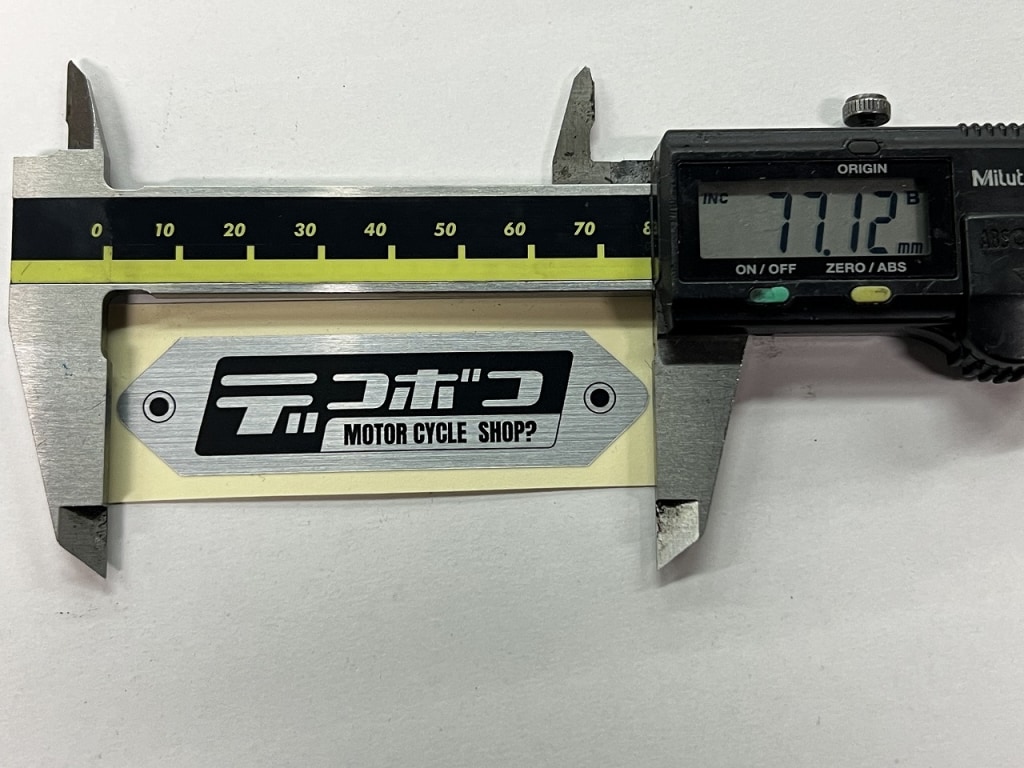
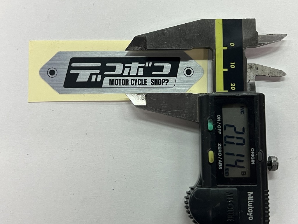
I made nameplate-type stickers.
The silver has a hairline finish and really nice texture.
The gold captures that nameplate feel, I think.
The size is compact, so you can easily use it anywhere—on screens, helmets, swingarms, you name it.
And as a bonus… it’s actually a clear sticker (black & white)
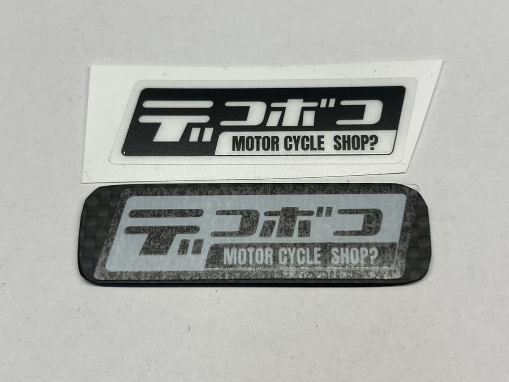
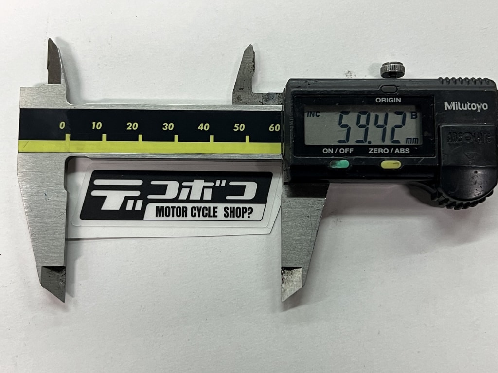
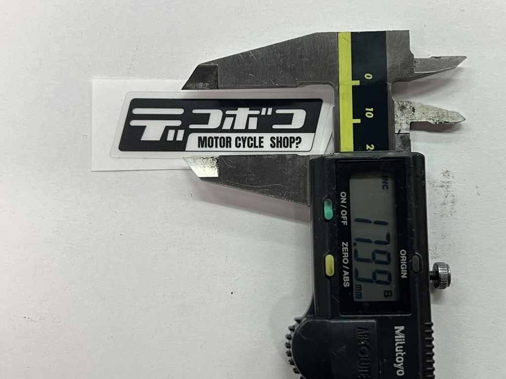
While making novelties, I got into it and suddenly had an idea…
It’s surprisingly hard to explain to designers and vendors “cutout letter stickers.”
The black version is easier to communicate, but “the white version” is a bit tricky.
In Illustrator, if the background is white, it’s just pure white.
When I made the background yellow, “are the letters yellow?” —that’s what happened.
The simplest way to explain it was the black version as “black made white” —that was the clearest way to communicate it.
The rubber keychain got a new design too
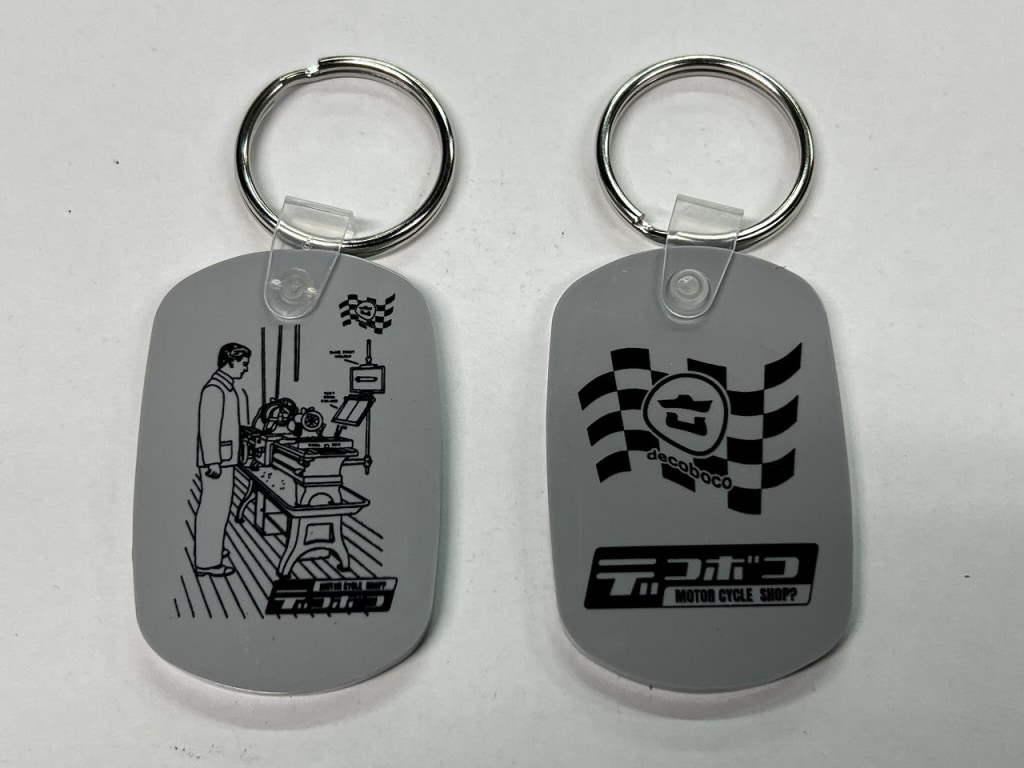
I originally planned to print on clear blue,
but “black text on blue is hard to read,” so we switched to gray.
The way it looks in Illustrator and the actual product are really different, so it’s surprisingly difficult, I realized.